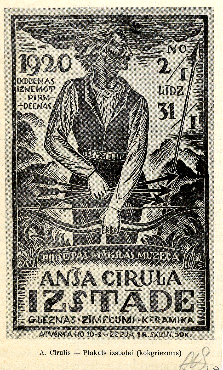
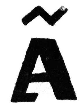
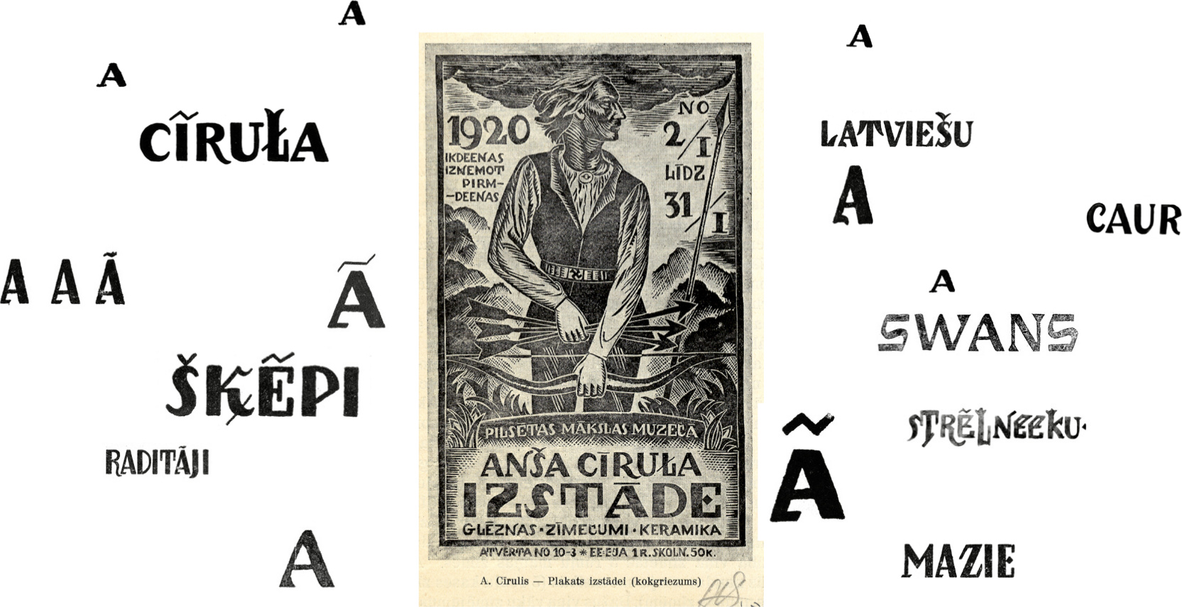
Ansis Cīrulis (1883-1942), one of the first Eastern European designers, greatly contributed to Latvia's identity. The artists heritage is characterized by letters with asymmetric widths, sliced cuts and various intrinsic features.


By carefully studying forms and origins of the letters, we've designed a new contemporary typeface. With many references to Ansis' work, «Cīrulis Display» introduces new forms, glyphs and features to match today's standards and needs.
Typeface has two weights.
Broad character set with over 400 glyphs per weight.
European language support
Lining and oldstyle figures
Contextual alternatives
Ligatures
Stylistic alternatives
Case sensitive forms
A display typeface that works well above 25 points paired with various sanserifs
national romantism typography revisited & refined
Catalan punt volat, Dutch lange ij and more
See PDF specimen for full character set, language support and OpenType features
The typeface was designed for Miesai and for several years was used exclusively in «Cirulis Design Heritage» line of home and interior objects. In 2017 Cīrulis Display was for the first time released to the public.